Wednesday, July 31, 2013

How to create a Pareto chart in OpenOffice.org or LibreOffice

Using the data from my article about creating Pareto charts with Google charts I'd like to show here how to create Pareto charts in OpenOffice.org or LibreOffice.

Starting with a data set the same issues need to be resolved:

  • Sorting the data
  • Calculating the accumulated percentages
  • Creating the chart with data in columns, percentages as a line and two y-axes.

    First lets enter the data in a spreadsheet like this:

    I added already the third column labeled Pctg which will be calculated later.

    Step 1: sort the data

    Mark all rows from 2 to the last and call Data -> Sort... and in the Sort Criteria tab choose Sort key 1 and change the entry to Column B and also tick Descending and finally OK.

    Step 2: Create the Percentage values

    Click on C2 and enter this formula = 100*SUM(B$2:B2)/SUM(B$2:B$8) . Note that there is only one variable B2, the other rows are fixed.

    and copy it to C3:C8 by dragging it down. This should result in the accumulated percentages being calculated

    Now we have all the data so we can continue with the actual chart.

    Step 3: Create the basic chart

    Go to Insert -> Chart... and in the upcoming Chart Wizard choose the chart type Column and Line with Number of lines set to 1 (if not already done so) and click Next.

    Select the correct data range $A$1:$c$8 by either using your mouse in the data range selector or by entering it manually. Leave the settings Data series in columns, First row as label, First column as label and click Next.

    The following Data Series window should have everything filled in correctly, click Next.

    In the last window enter titles and remove the legend:

  • Title: Pareto chart
  • X axis: Category
  • Y axis: Sizeand click
  • Untick Display legend
    and click Finish.

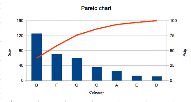
    And this is the result:

    What you can see: there is only one y-axis and the data and percentage units are not distinguishable.

    Step 4: Fine tune the chart

    First we are introducing an additonal y-axis. Ensure the chart is marked.
  • Right click on the chart and choose Insert/Delete Axes.... Under Secondary Axes tick Y axis and OK. This will create a second identical y-axis on the right.
  • With the chart still marked right click again and choose Insert Titles... and under Secondary Axes and Y axis enter Pctg.

    Now we need to join the secondary y-axis with the line chart. 
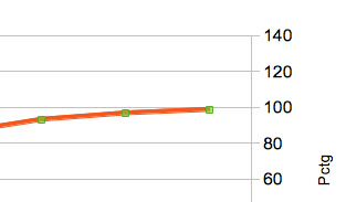
Select the red line. This can be a bit tricky, you are successful if the green selection points are shown like this

    Now right click on the red line and choose Format Data Series.... Select the Options tab and under Align data series to tick Secondary Y axis. Click OK:

    The range of the secondary y-axis has changed to 0 - 120 but this automated setting is not yet what we want.

    Mark the secondary y-axis e.g. by clicking on any of its numbers. Choose Format Axis... and in the Scale tab go to Maximum, untick Automatic and enter 100 as the maximum value.

    This is the new graph:

    There are some more actions needed to make the graph look closer to my Google chart example but I won't show all the details:

  • change the range of the primary y-axis to 160 and its major intervals to 40 and thus reduce the grid lines
  • change the major intervals of the secondary y-axis to 25
  • change the font attributes of each title to italic
    So here is the final result:
  • Tuesday, July 30, 2013

    LibreOffice writer: customize border of every second table row

    Lately I wanted to achieve the following in LibreOffice writer: I had created a table and I wanted to have borders around the uneven rows whereas rows two, four should be without borders.
    An example explains it quickly.

    Note that there is no border between cells and that the even rows don't show borders.

    Here is how to do this.

    Create table

    The first step of course is to create a table in writer via Insert -> Table and choosing 5 rows. Then fill in the cell contents as displayed above, the result being

    Remove all borders

    The next step is to clear all borders. There are two ways to do this, I'll show one.
    Click any table cell and choose Table -> Table Properties.... Click on the Set No Borders icon (circled red) and OK.

    This will result in this table.

    Adding row borders

    For this and the following steps you should enable the table toolbar via View -> Toolbars -> Table which will display a new toolbar at the bottom of your LibreOffice window.

    It is easy to set the border for one row:

  • Select the row (either by marking all cells from left to right or by moving the cursor outside of the table to the left of the row until the cursor changes shape into a little arrow and clicking that arrow)
  • Click on the border icon (red circle) in the table toolbar to get a selection of border settings and set the full border (blue circle)

    which should result in this

    The cumbersome thing is: one needs to do this for each row individually, in my case rows 3 and 5.
    As one can see this is not feasible for big tables (say 20 rows or more) and there is also no easy way to change this later (if you suddenly wanted a different border setting with no borders on the left you would need to redo these steps for all rows again).
    I haven't found a nicer way to do this. Trying to mark non-consecutive rows 1, 3 and 5 did not work, in essence there doesn't seem to be a way at all in LibreOffice (or OpenOffice.org) to mark non-consecutive rows in writer (I'd be glad if someone showed me a more efficient way to set the borders).

    Anyway: with this approach I finally got my table as outlined at the beginning.

    Some more customizations: line style and colour

    Further customizations are again quite easy. First of all you always have to select the whole table (either by marking all cells or by clicking in the left cell in the first row and then shift clicking the left cell in the last row).

    Then one could set the line style by clicking the line style icon (red circle) and then choosing from the list (the blue ellipse chooses the very last entry).

    After that the table is still marked and one could continue to set the line colour by clicking the colour icon (red circle) and choosing a colour (blue circle).

    The result looks like this: a thicker border line in orange

  • Monday, July 15, 2013

    CSS customization of blogger template

    I have been asked how I achieved the coloured fonts in my code examples. It's done via some customized CSS code.

    My code examples are either inline using the <CODE> tag or longer code text is wrapped in <PRE> tags.

    Examples:

    Some inline code and

    some
    longer
    text
    

    How to add CSS customization

    In the blogger main menu choose
    Template
      Customize
        Advanced
    
    In the list of advanced customizations scroll down to
          Add CSS
    
    and in the text field enter
    code {color:#8b0080; background:#ffffff; }
    pre  {color:#8b0080; background:#ffffff; border:solid 1px black; }
    
    which shows customizations for CODE and PRE:
  • one setting for the font colour (a kind of purple)
  • one setting for the background colour (white)
    Additionally PRE gets assigned a small black border line.

    I also have another customization for H2 headers:

    h2 { text-transform: capitalize}
    
    which capitalizes text so
      This is a nice text
    is shown as

    This is a nice text

    This example shows nicely that these customizations are added on top i.e. font type, font attributes (bold in this case) etc. remain as defined earlier (in the template definition by the template author).