Showing posts with label Pareto chart. Show all posts

Wednesday, July 31, 2013

How to create a Pareto chart in OpenOffice.org or LibreOffice

Using the data from my article about creating Pareto charts with Google charts I'd like to show here how to create Pareto charts in OpenOffice.org or LibreOffice.

Starting with a data set the same issues need to be resolved:

  • Sorting the data
  • Calculating the accumulated percentages
  • Creating the chart with data in columns, percentages as a line and two y-axes.

    First lets enter the data in a spreadsheet like this:

    I added already the third column labeled Pctg which will be calculated later.

    Step 1: sort the data

    Mark all rows from 2 to the last and call Data -> Sort... and in the Sort Criteria tab choose Sort key 1 and change the entry to Column B and also tick Descending and finally OK.

    Step 2: Create the Percentage values

    Click on C2 and enter this formula = 100*SUM(B$2:B2)/SUM(B$2:B$8) . Note that there is only one variable B2, the other rows are fixed.

    and copy it to C3:C8 by dragging it down. This should result in the accumulated percentages being calculated

    Now we have all the data so we can continue with the actual chart.

    Step 3: Create the basic chart

    Go to Insert -> Chart... and in the upcoming Chart Wizard choose the chart type Column and Line with Number of lines set to 1 (if not already done so) and click Next.

    Select the correct data range $A$1:$c$8 by either using your mouse in the data range selector or by entering it manually. Leave the settings Data series in columns, First row as label, First column as label and click Next.

    The following Data Series window should have everything filled in correctly, click Next.

    In the last window enter titles and remove the legend:

  • Title: Pareto chart
  • X axis: Category
  • Y axis: Sizeand click
  • Untick Display legend
    and click Finish.

    And this is the result:

    What you can see: there is only one y-axis and the data and percentage units are not distinguishable.

    Step 4: Fine tune the chart

    First we are introducing an additonal y-axis. Ensure the chart is marked.
  • Right click on the chart and choose Insert/Delete Axes.... Under Secondary Axes tick Y axis and OK. This will create a second identical y-axis on the right.
  • With the chart still marked right click again and choose Insert Titles... and under Secondary Axes and Y axis enter Pctg.

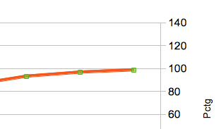
    Now we need to join the secondary y-axis with the line chart. Select the red line. This can be a bit tricky, you are successful if the green selection points are shown like this
    Now right click on the red line and choose Format Data Series.... Select the Options tab and under Align data series to tick Secondary Y axis. Click OK:

    The range of the secondary y-axis has changed to 0 - 120 but this automated setting is not yet what we want.

    Mark the secondary y-axis e.g. by clicking on any of its numbers. Choose Format Axis... and in the Scale tab go to Maximum, untick Automatic and enter 100 as the maximum value.

    This is the new graph:

    There are some more actions needed to make the graph look closer to my Google chart example but I won't show all the details:

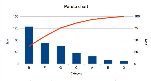
  • change the range of the primary y-axis to 160 and its major intervals to 40 and thus reduce the grid lines
  • change the major intervals of the secondary y-axis to 25
  • change the font attributes of each title to italic
    So here is the final result:
  • Thursday, January 31, 2013

    Pareto charts with Google charts

    As a follow-up to my recent post about histograms in Google charts I thought it would be nice to have a Pareto chart too.

    I often use Pareto charts only in the very simple sense of showing bars in descending order but if one wants to include the ascending percentage line there are two challenges here:

  • for a given data set one needs to calculate the accumulated percentages
  • the chart needs to show two graphs (columns and line) and two axes (left for bars, right for percentages)

    The first challenge needs to be coded, the second can be done with so called Combo Charts.

    Assume we have the following data represented as a 2-dimensional array in Javascript, not necessarily ordered since they will be reordered anyway. The column titles are kept in a separate array with an additional title for the percentages.

    var dataSet1 = [
        [ 'A', 25 ],
        [ 'B', 125 ],
        [ 'C', 35 ],
        [ 'D', 10 ],
        [ 'E', 12 ],
        [ 'F', 70 ],
        [ 'G', 60 ]
        ];
    
    var dataTitle = [ 'Category', 'Size', 'Pctg' ];
    

    The Pareto chart looks like this:

    How did I get there?

    There is a function which

  • first sorts the array according to column 2 in descending order (that is done by supplying the JavaScript built-in 'sort' with a sorting function of our own)
  • then calculates the total of column, calculates the percentages and puts the percentages into a new column in each row
  • prepends the data array with its title row

    function paretorize() {
      // Sort the dataSet array usung column 2
      dataSet1.sort( function(a,b) {
        return b[1] - a[1];
      });
    
      // Calculate the total of column 2
      var sum = 0;
      for(row=0; row<dataSet1.length; row++) {
        sum += dataSet1[row][1];
      }
    
      // Calculate the accumulating percentages
      // and add them into a new column in each row
      var accum = 0;
      for(row=0; row<dataSet1.length; row++) {
        dataSet1[row].push( accum+100*dataSet1[row][1]/sum );
        accum = dataSet1[row][2];
      }
    
      // Add the title row at the beginning of dataSet
      // ('unshift' is not supported in IE8 and earlier)
      dataSet1.unshift( dataTitle );
    }
    
    paretorize();
    

    Now that the dataSet array has been constructed it can be fed to the Google charts and a few options need to be set to take care of the second graph and axis. This is achieved by making vAxes an array of two axes with their own titles (and other attributes if needed) and by setting seriesType and series to specify standard behaviour and the special setting for the line chart.

    function drawChart() {
      var data = google.visualization.arrayToDataTable( dataSet1 );
    
      var options = {
        title:  'Pareto chart',
        legend: { position: 'none' },         // no legend
        // Create two vertical axes taking its titles from the first row
        vAxes:[
           { title: dataSet1[0][1], minValue: 0 }, 
           { title: dataSet1[0][2], minValue: 0, maxValue: 100 }
         ],
        hAxis:  { title: dataSet1[0][0] },
        backgroundColor: {strokeWidth: 2 },   // to get a nice box
        seriesType: "bars",                   // the standard chart type
        // the second data column should be of type 'line' and should be associated with the second vertical axis
        series: {1: {type: "line", targetAxisIndex: 1 }},  
        };
    
      // Note: this calls a ComboChart !!!
      var chart = new google.visualization.ComboChart(document.getElementById('chart_div'));
      chart.draw(data, options);
    }
    

    The same comments apply about chart width, number of data rows, size of columns as in the histogram blog.

    Putting all together

    The code snippets above are part of a Javascript script and need to be put into an HTML page as follows in order to display the chart.
    <script type="text/javascript" src="https://www.google.com/jsapi"></script>
    <script type="text/javascript">
    google.load("visualization", "1", {packages:["corechart"]});
    google.setOnLoadCallback(drawChart);
    
    ... put here all three code snippets from above ...
    
    </script>
    <div id="chart_div" style="width: 400px; height: 300px;"></div>
    

    One thing to note here: if you create several charts on one HTML page each of them needs to have its own id, function and needs to be set separately like

    google.setOnLoadCallback(drawChartA);
    google.setOnLoadCallback(drawChartB);
    google.setOnLoadCallback(drawChartC);
    ...
    
    function drawChartA() {
    ...
      // ComboChart or any other chart type of course
      var chart = new google.visualization.ComboChart(document.getElementById('chart_divA'));
    ...
    }
    
    function drawChartB() {
    ...
      var chart = new google.visualization.ComboChart(document.getElementById('chart_divB'));
    ...
    }
    
    function drawChartC() {
    ...
      var chart = new google.visualization.ComboChart(document.getElementById('chart_divC'));
    ...
    }
    
    and later place the chart wherever needed
    <div id="chart_divA" style="width: 400px; height: 300px;"></div>
    ...
    <div id="chart_divB" style="width: 400px; height: 300px;"></div>
    ...
    <div id="chart_divC" style="width: 400px; height: 300px;"></div>