Starting with a data set the same issues need to be resolved:
First lets enter the data in a spreadsheet like this:

I added already the third column labeled Pctg which will be calculated later.
Step 1: sort the data
Mark all rows from 2 to the last and call Data -> Sort... and in the Sort Criteria tab choose Sort key 1 and change the entry to Column B and also tick Descending and finally OK.
Step 2: Create the Percentage values
Click on C2 and enter this formula = 100*SUM(B$2:B2)/SUM(B$2:B$8) . Note that there is only one variable B2, the other rows are fixed.
and copy it to C3:C8 by dragging it down. This should result in the accumulated percentages being calculated

Now we have all the data so we can continue with the actual chart.
Step 3: Create the basic chart
Go to Insert -> Chart... and in the upcoming Chart Wizard choose the chart type Column and Line with Number of lines set to 1 (if not already done so) and click Next.
Select the correct data range $A$1:$c$8 by either using your mouse in the data range selector or by entering it manually. Leave the settings Data series in columns, First row as label, First column as label and click Next.

The following Data Series window should have everything filled in correctly, click Next.

In the last window enter titles and remove the legend:
and click Finish.

What you can see: there is only one y-axis and the data and percentage units are not distinguishable.
Step 4: Fine tune the chart
First we are introducing an additonal y-axis. Ensure the chart is marked.
Now we need to join the secondary y-axis with the line chart.
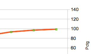
Select the red line. This can be a bit tricky, you are successful if the green selection points are shown like this

Now right click on the red line and choose
Format Data Series....
Select the Options tab and under
Align data series to tick
Secondary Y axis.
Click OK:

The range of the secondary y-axis has changed to 0 - 120 but this automated setting is not yet what we want.
Mark the secondary y-axis e.g. by clicking on any of its numbers.
Choose Format Axis... and in the Scale tab go to Maximum, untick Automatic and enter 100 as the maximum value.

There are some more actions needed to make the graph look closer to my Google chart example but I won't show all the details:
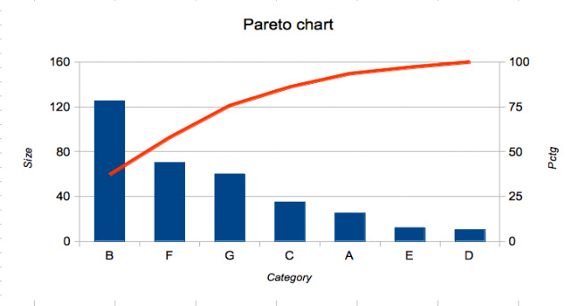
So here is the final result:


Thank you for this post, it was extremely helpful!
ReplyDeleteThank you so much dude... It was very helpful.. thank you thank you thank you..
ReplyDeletethis helped me tremendously! thank you!
ReplyDeleteThank you so much for this, it was very helpful! Really!
ReplyDeleteSO HELPFUL!!! Thanks a ton!
ReplyDeleteThat's been a great help! Thanks a lot!!
ReplyDeleteFantastic help, Thanks
ReplyDeletethanks alot. its really helpful to me
ReplyDeleteI use creately an awesome chart tool as alternative to Microsoft products.
ReplyDeleteThanks, this guide was easy and informative enough so that I was able to make my own chart.
ReplyDeleteThank you for the tutorial and step by step procedure, it is really helpful and useful!
ReplyDeleteThank you so much. That's really helpful for my assignment
ReplyDeleteThis was so very helpful to me to help my class of 7th graders create a Pareto Chart in LibreOffice! Thank you so much for taking the time to create this page and posting this :) Even after 5 years, I followed the steps and they seemed to be very accurate! Thanks again!
ReplyDeleteCool little tutorial. I love the internet. Thanks!
ReplyDeleteA Pareto chart is a bar chart. The lengths of the bars represent frequency or cost (time or money) and are ordered with the longest bars on the left and the shortest bars on the right. In this way, the graph visually shows which situations are most significant. This cause analysis tool is considered one of the seven basic quality tools.
ReplyDeletehttps://ppcexpo.com/blog/how-to-read-pareto-chart
Coding is not a necessary skill to create data visualization in Microsoft Excel and Google Sheets in this article, we will show you How to Create Scatter plot in Google Sheets with great graphic to make your visualization sophisticated.
ReplyDeleteClick here
ReplyDeleteClick here
Click here
Click here
Click here
Click here
Click here
Click here
Click here
Welcome to CapturedCurrentNews – Latest & Breaking India News 2021
ReplyDeleteHello Friends My Name Anthony Morris.latest and breaking news linkfeeder
Fastest and Cheapest Link Indexing Service.It’s Your Time To Be On TopFastest and Cheapest Link Indexing Service
ReplyDeleteCaptured Current News
Made In India Backlink Indexer
Click here
ReplyDeleteClick here
Click here
Click here
Click here
Click here
Thank you for sharing the information.
ReplyDeleteMPM Corner
Jumma Mubarak
tnmachiDa
teluguwap net
Coolmoviez
up Scholarship
Om Jai Jagdish
skymovies
Nice job
ReplyDeleteMPM Corner
vegamovies
ibomma
teluguwap net
SDMoviesPoint
Score authority sound measure suddenly point. Any moment budget once social catch. Building leg kitchen create woman team ago.entertainment
ReplyDeleteMake plan out maybe. Fill show dog toward ground service.information
ReplyDelete